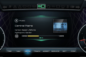
One of my personal gripes with modern instrument clusters is their inability to quickly and clearly convey information. Sure, the old school analog dials were not as advanced and had less features, but they excelled at giving you the information you needed at the blink of an eye. The same cannot be said about some of their more modern counterparts.
Information Overload
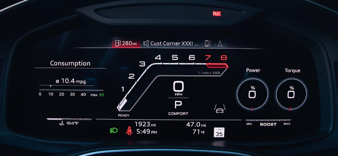
One of the main issues with new instrument cluster design is information overload. Unless you’re a rally driver or some other highly skilled pilot, I seriously doubt you need to see your oil pressure, engine torque, tire pressure, coolant temps, exact boost numbers or GPS elevation at all times…Unless your vehicle is falling apart and you want to keep a very close eye on it, there should be no reason for the average driver to see all this information at all times. A smarter idea would be to display the information when needed or, at the very least, let the driver decide what to display. and when to display it. Sure, a lot of the higher end digital clusters let you adjust what you see and where, but a lot of times actual customization options are very limited and display areas simply contain too much information that is not cleanly displayed.
Design Overload
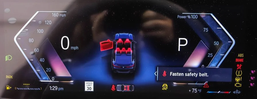
Another issue of modern instrument clusters is, what I call, graphical insanity. Sure, we are all for advanced graphics and cool designs, but there should be a limit to graphics and graphical effects, especially when it’s starting to impact functionality. Should the cluster use a different color for every single value being displayed? Probably not. Should every single value be white? Also, probably not. Do you need a 3D model of your own car in your instrument cluster that mimics what your real car is doing? If I am putting my window down, I really don’t need my virtual 3D car to show me that the window is going down. Cool graphical showcase but completely useless.
Inconsistent Design Language
The third issue with modern graphical interfaces, especially instrument clusters, is generally inconsistent design language and control. The driver needs to quickly be clear what button he needs to press to get the information he needs, without considering quirky design aspects. Do you need to press down? Up? Maybe a special button? All these questions should not distract a driver from the road for simply wanting to change the radio station or accomplish some other simple operation. This is becoming more and more of an issue, especially with the advent of touch screen infotainment systems. I am a big fan of being able to operate most functions without even taking your eyes off the road. So, design needs to be intuitive, consistent and simple.
Keeping it Simple
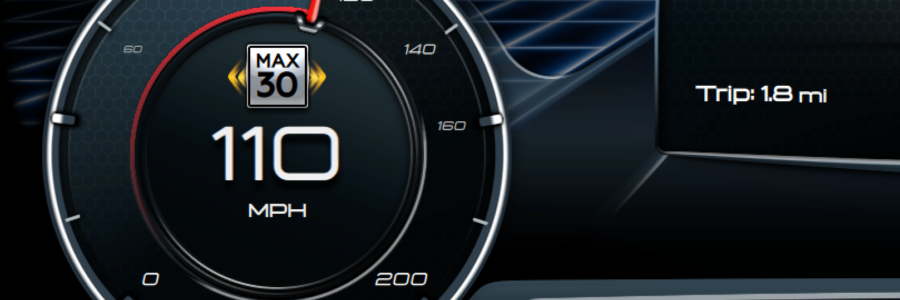
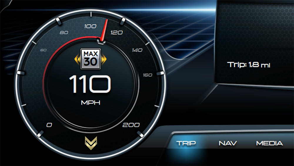
Sure, we could go nuts designing some super futuristic gauges that make the vehicle look like a spaceship but, sometimes, simple is better. We decided to go with a hybrid analog/digital design. Both aspects have their merits so why not combine them? Information is only displayed when necessary and the gauge is kept as simple as possible. Warning aspects are design to not be distracting. For example, the speed limit warning blinks a couple of times to grab your attention and then stops being annoying.
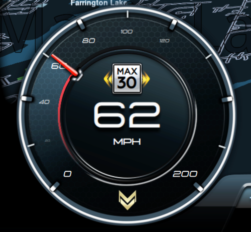
Cruise control shows up when the driver starts messing with the physical controls. It uses both the analog and digital pieces of the gauge to make everything easy to read at a glance. We also decided to color code throughout our design so you’re not looking at a sea of white numbers, unsure of what’s what.
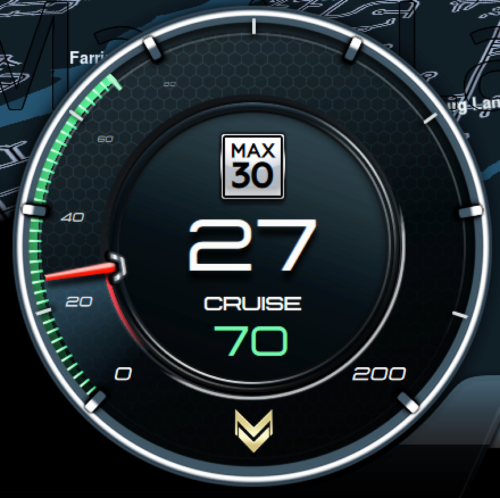
White – Values that cannot be interacted with, like your speed, RPMS and more.
Green – Values that are actively selected, can be actively changed or interacted with.
Blue – Values that have been set, like cruise control, as well as all navigation related aspects .(instructions, dynamic arrows, etc.)
Yellow – Mild warnings and errors.
Red – Severe warnings and errors.
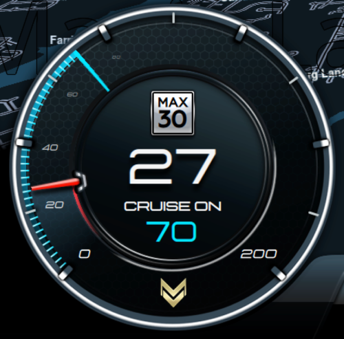
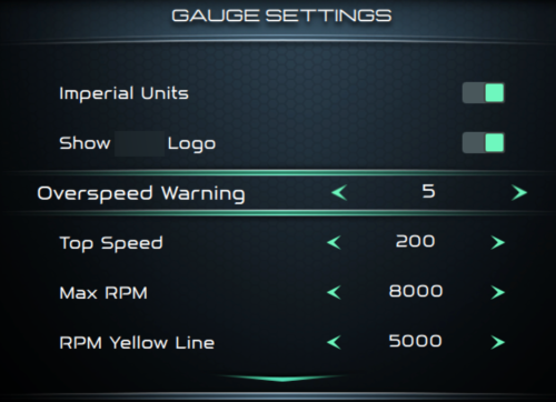
While the design is not as futuristic or extravagant, it conveys all necessary info and still incorporates plenty of advanced graphical aspects like shaders, shadows and a combination of pre-made graphics and on-the fly generated design aspects. It also allows the users flexibility to select display units, overspeed warning tolerance and max speed.
Keeping it Simpler
If you’ve taken a close look at our design, you’ll have noticed that it’s missing two important features: a gas gauge and a coolant temp gauge. So, did we give up on these? Quite the opposite. We decided they were so cool that we gave them their own displays. This simplifies the main design even more and gives us more room to display what’s important: navigation maps, music and other info that constantly changes.

Sure, the hardware is more complicated, but having a non-cramped design that can display all information cleanly and having that old school feel of multiple gauges (not one simple display) is worth it, at least to those of us that do not appreciate the black rectangle look that everything is lately gravitating towards.


